Mobile Banking App
UX Design Institute - 2022
Project Overview
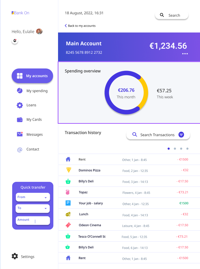
Mobile Banking is a case study I completed for my UI Diploma at the UX Design Institute (Glasgow Caledonian University) in 2022. The objective was to create a fresh new interface for a responsive banking application for three screens on desktop, tablet and mobile (nine screens in total).
Process
I received a basic black and white concept, which I had to redesign, keeping in mind the brand principles (playful, clear, and trustworthy). I worked through the UI design by 1. creating a moodboard; 2. Choosing a colour palette and fonts; 3. Generating icons; 4. Creating UI components and 5. Designing the wireframes.
Moodboards and References
I started the redesigning process by creating the moodboard, searching for inspiration and conducting a reflexion around design standards. I wanted to understand what is the biggest trend in visual design and user flow in mobile banking. On my mood board, I put the design examples that correspond at least to one of the brand principles. I gathered inspiration from sites like Dribbble, Pinterest and Behance.
Colour Palette & Fonts
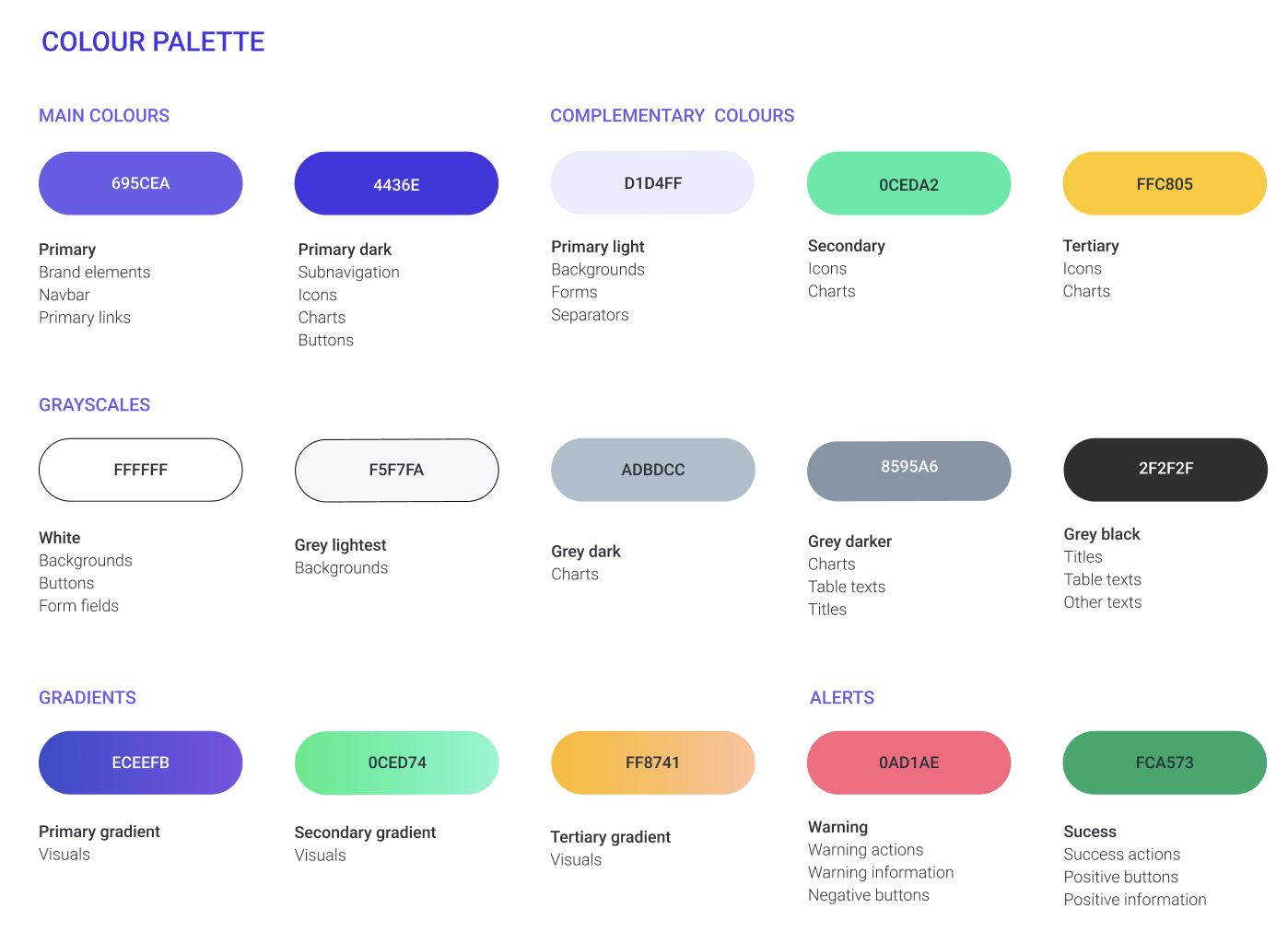
I used purple as the main colour (primary and primary dark) and light green and orange tones for complementary colours.
I believe they are clear, playful and cheerful. The purple is associated with trustworthiness, while the green is associated with clearness and the orange corresponds to playfulness. I used these colours with white and light purple backgrounds to make the design as clear as possible and avoid overloading with colours.
I used grey black for the font, so it isn't entirely black colour. Also, from a strict visual aspect these 3 bold colours work really well together unexpectedly and stimulate the user.
I chose some gradients based on the main and the complementary colours to apply to visuals and give a bit more depth and playfulness to the design. Otherwise, it would be too flat. I chose the sans-serif font, Noto Sans which seems pretty clear and modern.
Icons
I created icons based on the inspiration I gathered in the first step. I used simple, clear and modern icons with not much detail. I applied the primary and primary dark colours to them.
UI Components
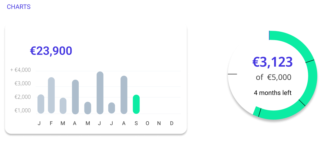
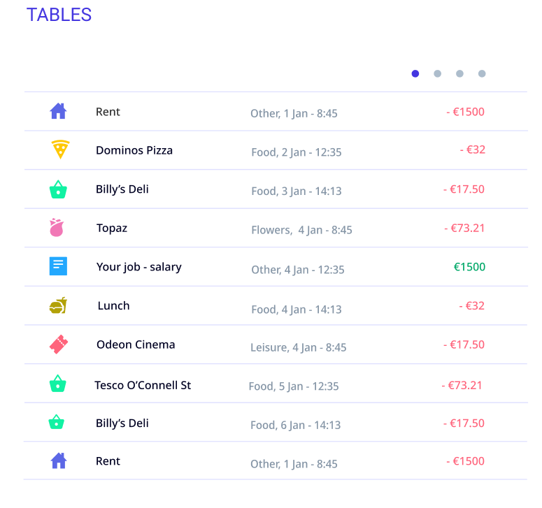
I explored different designs of patterns, shapes, buttons, form fields, tables, menus and graphs which eventually became my UI components. I created a global style based on the chosen colour palette and the font, which I applied to the UI components.
Wireframes
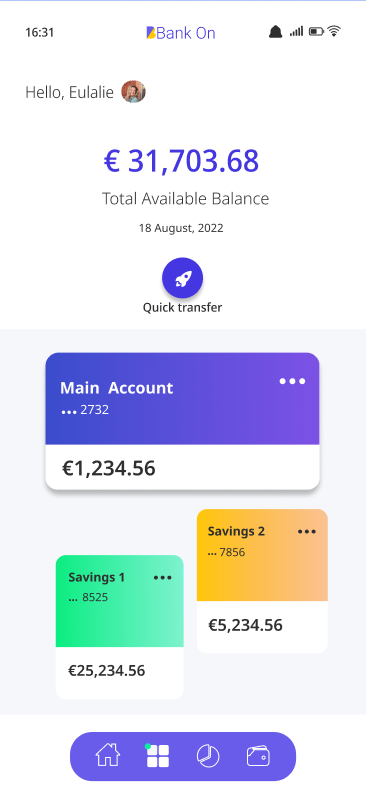
I redesigned the mobile screen first, then the tablet screen and to finish with the desktop.
I worked on the layout and the main lines first, including the main navigation bar. After that, I added shapes, buttons and content. I applied the global style to the wireframe.
My designs changed several times, sometimes I erased everything to start again from scratch. I also changed the brightness or the saturation of the colour palette.
My Accounts
Current Account
My Spending


